|
The 1st month of the year has already gone by! I mostly worked at Therma-Tru this month, since classes didn't start until January 28th (and then were promptly canceled for two days due to the Polar Vortex). So I don't have any school projects to show you yet, but I will show you some small things I worked on this month.
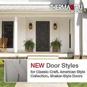
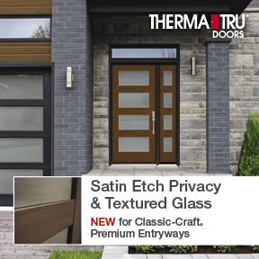
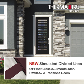
At Therma-Tru, one project I worked on was a marketing request for several online ads. Many of them just involved updating files from last year, but I did have the opportunity to create some new ads for our new products. The layout I used, a predominant beauty shot with a bar containing text and a small square angled shot, is very similar to the brochure cover designs for 2019. I had to format the text a bit differently for each once because of the varying amounts of text. I enjoyed making these though and I especially enjoyed picking from our new images for the beauty shots. I feel like I'm watching HGTV all day when I'm working with beauty shots.
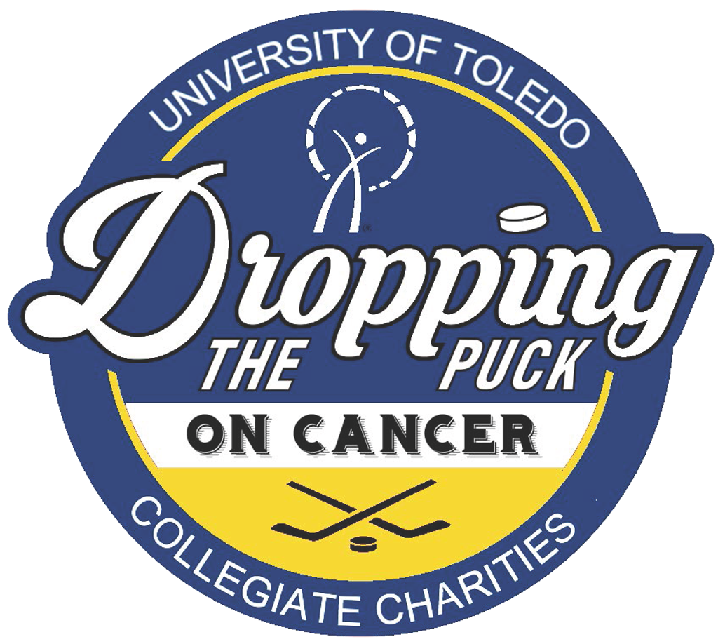
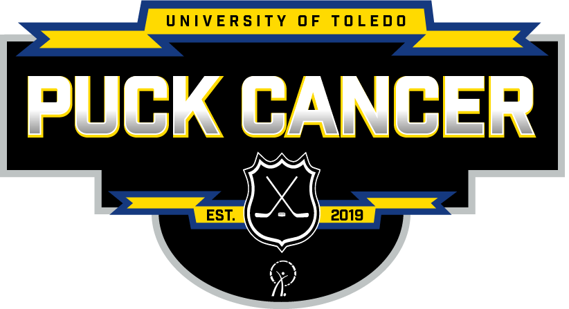
Another project I worked on was for my coworker, who is a University of Toledo student on the exec. board of what was previously Dropping the Puck on Cancer. To raise money for cancer, groups of students sign up and pay to play in a hockey tournament at the school. This charity has groups at many different colleges, but this year University of Toledo decided to form their own separate charity instead called Puck Cancer and they needed a new logo. You can see the old logo above in the blue circle. This logo has a lot of different fonts competing with each other and they don't create a very uniform look and feel. You have the large script font for "Dropping" but then an italic sans serif in all caps for "the Puck". These fonts both have a thin black outline despite the fact that the white text already contrasts well against the blue background. The all caps serif font below, used for "on Cancer" is the only text in black and despite already having high contrast against it's white background, there is some sort of drop shadow added to the text. This is the only text with a shadow or dimension and I think the shadow actually makes it harder to read. Lastly, there is the thin san serif font used around the edge of the circle, which appears to be different than the other sans serif font used earlier for "the Puck". Aside from the wide range of fonts, the hockey stick imagery at the bottom seems stretched weirdly and the blue and yellow used are slightly off from the University of Toledo's colors. Even though UT is my rival school (go falcons), I was glad to help my coworker. Obviously the new name, "Puck Cancer", was one of the requirements for the new logo, and my coworker also wanted to incorporate the hockey sticks & puck, the sponsor's logo, the year it was established, and the school's name and colors. She also wanted it to have a more sporty feel with banners and dimension to it, and she showed me some examples of other sports logos she liked, which was very helpful. I used large blocky letters and all caps to capture the tough, intense, sporty mood. I also applied a slight gradient and outline to the "Puck Cancer" text to give it a metallic look and I added a slight yellow "shadow" behind it to give it some dimension and a pop of color. I also incorporated the school colors into the banners so that it was noticeable and eye catching but not overpowering. I had some trouble figuring out how to incorporate the hockey sticks without losing them in the design, and I ended up placing them inside a shield shape to add some more dimensions and separate them from the surrounding elements that they were previously blending in to. Now when you look at the logo, you immediately think sports and hockey. I don't have a ton of logo experience, and it's not perfect, but I think this logo more accurately conveys the look and feel that the group wanted. Thanks for checking out my projects! Any feedback is appreciated.
1 Comment
|
AuthorPaige Isovitsch specialized in photography and print media, but through her studies in Visual Communication Technology she has learned about web design and videography as well. 
Categories
All
Archives
April 2021
|

 RSS Feed
